ENERGIFY image language
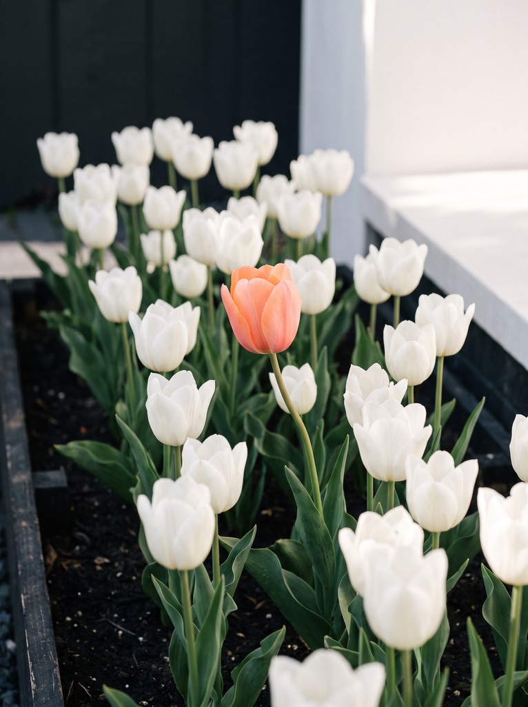
The photo series behind our image language: one coral object in a calm, real-looking scene. It runs through this website and the Visuals gallery.
- Type
- Personal project
- Year
- 2026
- Disciplines
- Art direction, Image curation
- Tools
- Selection · Sequencing
Context
A brand needs a recognisable image language as much as a logo. This series follows one rule, so any new photo still looks like ENERGIFY.
Approach
- One coral object per frame; everything else black, white or grey
- Calm, real places: streets, interiors, architecture
- Portrait 3:4 format, so every photo fits the same frame
- Used on the home page, the services page and in the Visuals gallery